--- layout: home title: Bootstrap --- <main class="bs-docs-masthead" id="content" role="main"> <div class="container"> <span class="bs-docs-booticon bs-docs-booticon-lg bs-docs-booticon-outline">B</span> <p class="lead">Bootstrap is the most popular HTML, CSS, and JS framework for developing responsive, mobile first projects on the web.</p> <p class="lead"> <a href="getting-started#download" class="btn btn-outline-inverse btn-lg" onclick="ga('send', 'event', 'Jumbotron actions', 'Download', 'Download {{ site.current_version }}');">Download Bootstrap</a> </p> <p class="version">Currently v{{ site.current_version }}</p> {% include ads.html %} </div> </main> <div class="bs-docs-featurette"> <div class="container"> <h2 class="bs-docs-featurette-title">Designed for everyone, everywhere.</h2> <p class="lead">Bootstrap makes front-end web development faster and easier. It's made for folks of all skill levels, devices of all shapes, and projects of all sizes.</p> <hr class="half-rule"> <div class="row"> <div class="col-sm-4"> <img src="assets/img/sass-less.png" alt="Sass and Less support" class="img-responsive"> <h3>Preprocessors</h3> <p>Bootstrap ships with vanilla CSS, but it's source code utilizes the two most popular CSS preprocessors, <a href="../css/#less">Less</a> and <a href="../css/#sass">Sass</a>. Quickly get started with precompiled CSS or build on the source.</p> </div> <div class="col-sm-4"> <img src="assets/img/devices.png" alt="Responsive across devices" class="img-responsive"> <h3>One framework, every device.</h3> <p>
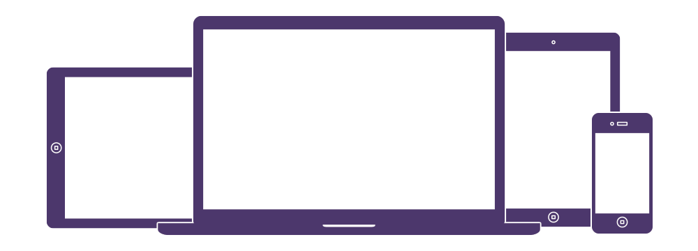
Bootstrap easily and efficiently scales your websites and applications with a single code base, from phones to tablets to desktops with CSS media queries.</p> </div> <div class="col-sm-4"> <img src="assets/img/components.png" alt="Components" class="img-responsive"> <h3>Full of features</h3> <p>With Bootstrap, you get extensive and beautiful documentation for common HTML elements, dozens of custom HTML and CSS components, and awesome jQuery plugins.</p> </div> </div> <hr class="half-rule"> <p class="lead">Bootstrap is open source. It's hosted, developed, and maintained on GitHub.</p> <a href="{{ site.repo }}" class="btn btn-outline btn-lg">View the GitHub project</a> </div> </div> <div class="bs-docs-featurette"> <div class="container"> <h2 class="bs-docs-featurette-title">Built with Bootstrap.</h2> <p class="lead">Millions of amazing sites across the web are being built with Bootstrap. Get started on your own with our growing <a href="../getting-started/#examples">collection of examples</a> or by exploring some of our favorites.</p> <hr class="half-rule"> <div class="row bs-docs-featured-sites"> {% for showcase in site.data.showcase %} <div class="col-sm-3"> <a href="{{ showcase.expo_url }}" target="_blank" title="{{ showcase.name }}"> <img src="{{ showcase.img }}" alt="{{ showcase.name }}" class="img-responsive"> </a> </div> {% endfor %} </div> <hr class="half-rule"> <p class="lead">We showcase dozens of inspiring projects built with Bootstrap on the Bootstrap Expo.</p> <a href="{{ site.expo }}" class="btn btn-outline btn-lg">Explore the Expo</a> </div> </div>